Zines
As a group, we experienced with these given images and arranged them into different zines.
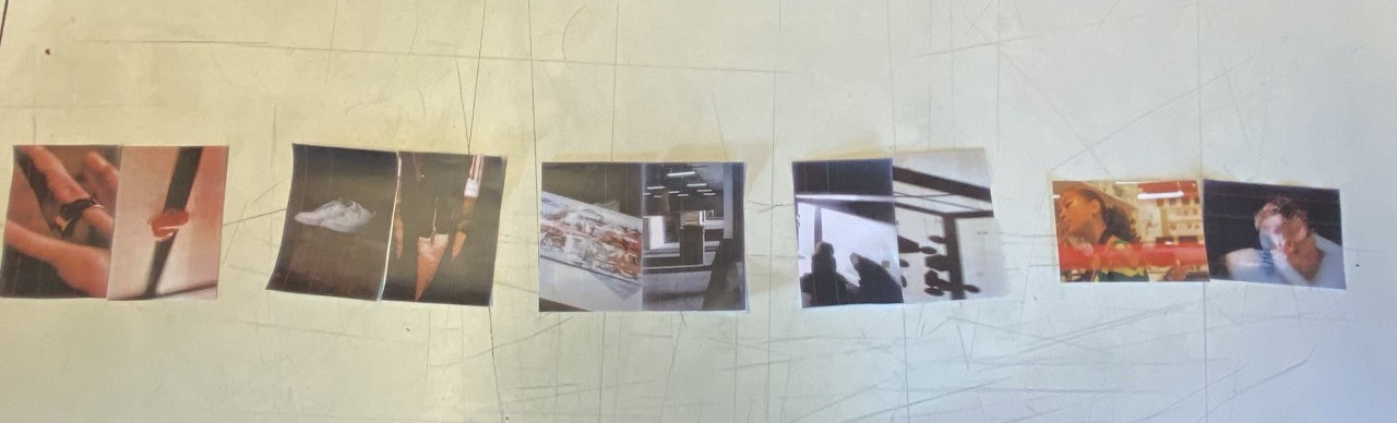
A zine arranged into diptychs.
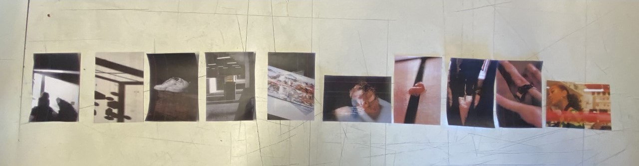
A zine ordered with a different range of diptychs (but with the same photos)
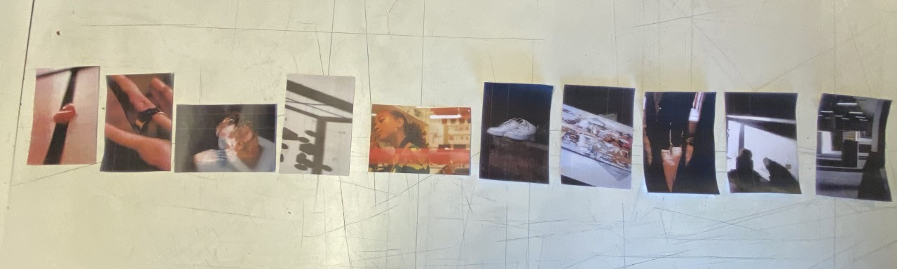
A zine ordered from containing the least colour to the most.
Laura Et Tantawy - a British/Egyptian photographer
Laura Et Tantawy's project was inspired by her life her tranquil view of life and her personal experiences due to initially living in Egypt but moving to the US for 9 years. Her project initiated due to the unexpected loss of her maternal grandfather, which caused a sense of urgency to return to Egypt and reconnect with her family from her homeland. Later when she returned, she was confronted with more unpleasant news that her maternal grandmother was also experiencing illness. Whilst experiencing grief and other negative emotions, she knew she needed an outlet and a form of release to cope. Her escape became going out on the streets and simply trying to reconnect herself with these once well known streets and piecing together her emotions, as well as attempting to figure out her place in this new society as she had experienced a much different culture in these past 9 years. At first, she has the intentions of simply taking images to create a book however she lacked an idea as to what the final concept would consist of. Despite this, she had some idea as to what she wanted express through her photos and her book; she wanted to create a series of images that bridged her personal narrative through her search for her own personal identity (which she later realised that this was an issue for others apart from her as well). Previously, Tantawy started her photography career as a newspaper photographer with her organic style of capturing images. However, now she only takes images as a response to something she is feeling or experiencing emotionally. Her intentions were to communicate a general story but with a personal narrative, resulting in her exhibition to contain a soundtrack. The reason for this soundtrack was to evoke an emotional response to these sounds, as well as the audio being able to be interpreted as a memory or thought. For her, this book has an incredibly sentimental meaning to it, additionally an upsetting undertone (which was intentionally done).
For me, I don't think that there was much danger around capturing these images, unless they contained a scene that was unsafe to be in. I think the only risk was her choice of going out alone as in incredibly traditional countries like Egypt, may not be ideal for a woman as there remains a lack of equality between the genders. Personally, I was drawn in by the sentimental value that this book holds for Tantawy and I admire her search for her identity as that resonates with me well.
For me, I don't think that there was much danger around capturing these images, unless they contained a scene that was unsafe to be in. I think the only risk was her choice of going out alone as in incredibly traditional countries like Egypt, may not be ideal for a woman as there remains a lack of equality between the genders. Personally, I was drawn in by the sentimental value that this book holds for Tantawy and I admire her search for her identity as that resonates with me well.
My personal experience growing up in contrasting cultures is the window to this intimate & emotive visual exploration of the unsettling feeling of rootlessness, the mental burden of loneliness & the constant search for belonging in unfamiliar places - Laura Et Tantawy
A set of photographs inspired by Laura Et Tantawy
Click to set custom HTML
|
|
These images were captured in order to reflect ourselves and our culture through things which reminded us of our previous memories of our life at home (or homeland, place of birth etc...). Each of these communicate different things for me and my identity. I personally feel as if they accurately portray me, as well as my upbringing (despite photographing these images in school with a lack of personal objects and settings). Through this set ofphotos, I wanted to inform viewers of the upbringing I experienced with my grandparents. The images outdoors relate to me and my grandmother's shared passion for growing plants, such as apple trees. The last image of the painting of the frog relates to my grandfather's passion for art as their household is rife with unique paintings and images.
|


The images I most resonate with are these:
|
|
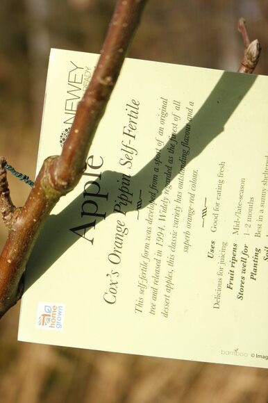
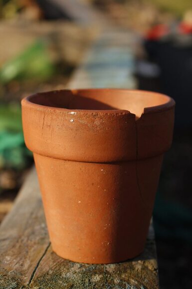
These images spark a nostalgic emotional response for me as the label of the apple tree is incredibly close to home. I essentially grew up with my grandmother, who acted with a parental role when I was much younger, and whenever I went to her home, I'd always explore around in the garden. My grandmother transformed the community garden as previously, it was empty and simply lacked any life. She took initiative and started growing a couple vietnamese vegetables and in her own section, she planted apple and pear trees (as well as other plants such as strawberry bushes and grape vines). When I was a child, the apple tree didn't blossom as much, however whenever a new fruit would appear and ripen, I'd make sure to pick it and eat it. Now, the tree is much larger and my grandmother collects all the fruit in a large basket and gives it to everyone (all my aunties, uncles, cousins.... everyone). Although a simple may not resonate or mean much to many people, it is certainly important for me. In addition to the label, a simple plant pot also brings me back to when I'd attempt to grow anything as a child. I'd always attempt to find a plantpot after eating a stoned fruit or anything with seeds in it and I'd fill it with soil and plant it. Though it never worked, it's a memory which I am incredibly fond of.
My book presenting my zine


For this zine, I used images I have previously taken as well as images I have taken throughout this course. When creating this zine, I was unsure what images to include as I didn't know what type of feel or theme I wanted. I used an application called 'Shrimpzine' in order to create this booklet, and I wanted the images to all be the same size but have one full bleed. Due to the wrong proportions whilst printing, the full bled images does not occupy the entirety of the space, however if it was printed correctly, I would've preferred the outcome of the book. I wanted the book to present everything around us, from the smallest to largest details, hence the title. I stapled the pages together, in order to bind them, however I dislike the simplicity of it.
Keld Helmer-Petersen - Black Light
  |
In Keld Helmer-Petersen's "Black Light", he captured images and explores the dramatic contrast between black images on a white background. Due to this great contrast, many textures and and shadows are exposed in his images and they add a form of mystery as we aren't always certain as to what we are viewing as we only see the solid parts of the photographed objects.
|
My attempt at Keld Helmer-Petersen's style of images
|
|
|


When capturing these photographs, I purposely ensured each image had textures that would be displayed once edited. I feel as if I was successful as the edited images have a strong contrast between the backgrounds and the objects in them. I edited these photos by using photoshop. Whilst on photoshop, I clicked on image, adjustments, threshold then I adjusted the threshold and chose which I believed looked best. I personally like these images as they lack much of a background and our sole focus is on the object we are presented with.
Taking images in an abnormal environment
For these images, I decided to photograph them at my place of work as a regular person wouldn't think to randomly bring a camera to work to capture the area, whilst on their shift. The environment is 'abnormal' as such but the situation, in this case, is.


I decided to take my set of images at the place I work as it transforms from a cafe in the day, to a Vietnamese restaurant in the evening throughout the night. If someone were to mention that information, I'd interpret it with an odd expression of confusion (which inspired my photoshoot here). These images, in my opinion, came out well and I am fond of the natural lighting displayed. In addition to this, I feel as if I captured the feel of the cafe, as well as the restaurant in two separate manners, which was my intention. My photos are ordered from the surroundings of the cafe to the surrounding of the restaurant, despite being in the exact same location, they reflect a different mood. At first, I wanted to take photos in a cemetery as that is most definitely an uncomfortable and strange location to capture images, however, I felt too out of place as disrespectful to do so.
Experimenting with photobook styles


Here, I am displaying the zine that I have created with a set of images. To create it, I used the application 'Shrimpzine' and rotated all of my images so I could fold them and create a smaller photo book than I had previously done (A5). I purposely paired specific images together by colour and left specific spaces between images so the book would flow better. Before, I was precautious when experimenting with colourful images, however I've gained a liking to creating diptychs of colourful images. I wanted my images to all be the same size (for this particular zine) so they flowed well and I feel as if it is much more pleasing to flip through. However, I would like to experiment with images that are full bleed across two pages and images that only take up half of a page. I personally enjoy when at least one image is larger and spread across the two pages as I feel as if you can look at the image more intensively and it adds an interesting variation of images. In this zine, the images aren't particularly ordered in a specific way, however, they're mainly diptychs with two single images. The two single images are there as I feel as if they make the zine flow better and I simply liked the images but did not have another to create a diptych. I planned to have a cream coloured cover with a small section folded on the front and back page inside the photo book and have some information written on those sections (with a different series of images). I want to keep the minimalistic style of a photo book as I feel as if it is nicer than when there is too much occurring on the pages. For this specific book, as it was a tester, I used normal A4 white paper and printed the images onto it, then using glue, I stuck the pages together and it created a spine like bind. For my actual book, I'd like to have a different cream coloured material (almost rough carpet) as the cover and use a thick card as the pages. I'd like for it to have a home-made feel to it as it would express my physically creative side. Another way I'd like to experiment is with stitching to bind the images (I would use a bright colour so it stands out).
Photography and Text

Max Pinckers - The Fourth Wall
Pinckers incorporates text into his book by having double pages with small sections of text in a large font, which is read across the two pages. In addition to this, he includes images of another book (shown at 1:40). I like the fact that the writing is not difficult to read and it links to the images (the double pages), however I dislike the book within a book. The concept is interesting, however reading it becomes a struggle and I'm not truly sure as to why it has been included/the context behind it. The paper used in the book is the paper used in a newspaper, making the pages incredibly delicate and makes the photo book feel unique. Each of the images are laid out and displayed in different sizes and ways, and it reminds me of the layout of a newspaper due to its irregularity.
