Two Frame Films
As a class, we played a game in order to create different pairs of photos by chance to form a diptychs. Two equal piles of photos were placed in front of us on a white background with the camera propped up by a copy stand with two white lights attached in order to ensure that it was a pure white light being viewed. In addition to this, we zoomed it in enough so only our hands were visible and the camera was above us facing downwards. We adjusted them to be centred in the frame, then we began playing. Each time, we rolled the dice and we removed the number of photos in correlation to the number that was rolled to create a diptych. With the first game, the pair were given no instructions and simply rolled the dice after they had removed their photos (they weren't in sync). By the end of the game, one pile was skewed and not neat as they were not instructed to keep the pile intact. When one person no longer had any photos, the film was stopped. With the second pair, the class decided to ensure the piles were neatly stacked, have less images, roll the dice at the same time and let roughly three seconds pass, before picking up the dice once more. Personally, I like this version of the game as it is much more pleasing to watch and I enjoy the organic sounds of the dice hitting the surface in complete silence. Lastly, with the final game, our class decided to play artificial music and sounds from our phones whilst the game progressed. In addition to this, the pair playing reverted back to having no specific instructions and it became, in my opinion, quite untidy and unpleasant to watch.
Each of these games created diptychs, completely by chance, and quite a few times the images truly correlated well although it was unintentional. An example would be at 00:27 as in both images there is some form of cylindrical pole with a rectangular shape above it, like a sign. The image on the left is a regular sign and the image on the right is almost a contorted version of it, clearly linking the two photos.
Each of these games created diptychs, completely by chance, and quite a few times the images truly correlated well although it was unintentional. An example would be at 00:27 as in both images there is some form of cylindrical pole with a rectangular shape above it, like a sign. The image on the left is a regular sign and the image on the right is almost a contorted version of it, clearly linking the two photos.
Diptychs deliberately paired
These diptychs were random images given to me, however I consciously chose the paired images.
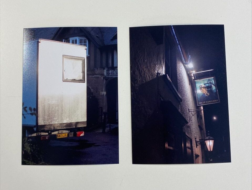
1: I chose to pair these two images as there seems to be almost a blank frame on the back of the truck and the image beside it has an image roughly the same size which fills up the frame. I simply like how one frame is empty and one that is being used.
|
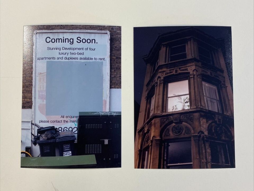
2: I chose to pair these two images as they seem to be presenting opposing ideas. The image on the left is a billboard stating that there will be a building 'Coming Soon' yet it is paired with an image of a well built home. I like the juxtaposing nature between the images.
|
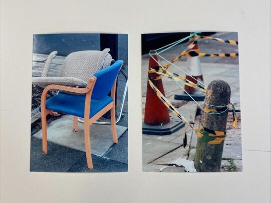
3: I chose to pair these two images and they both has a sense of irregularity. I feel as if they are similar in nature as the chairs are randomly placed on top of each other and the pole in the ground is slanted with yellow caution tape around it. With both images, I question why the objects are as they are (why the chairs are stacked and the pole is being sectioned off). Furthermore, I liked the contrast between the cool blue on the chair and the warm yellow of the tape around the pole.
|
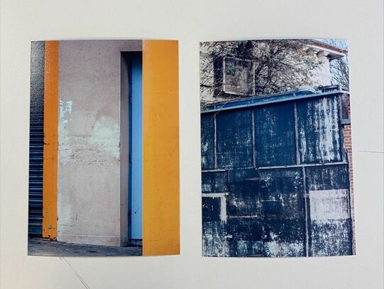
4: I chose to pair these two images simply due to the colours. Initially I liked the contrast between the warm yellow of the walls and the cool blue of the side of the wall. However, I realise that there is another link as there is a blue garage on the left of the first image which is similar to the colour of the other image and both have a worn down nature to them.
|
Diptychs chosen entirely by chance
The images were turned over and numbered, then paired by using a random number generator and these were the results.


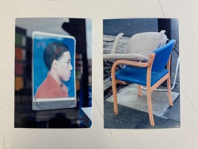
This diptych in particular was a personal favourite due to the combination of colours in both as despite the pairing of these two images being completely random, the colours are similar and work well as a diptych. In addition to this, I feel as if both images create a sense of curiosity to the viewer as I have no context as to why there is an image of a person in a window and once more I do not know why the chairs have been left and placed on this particular street.
Luke Fowler - a film maker (primarily) based in Glasgow
    |
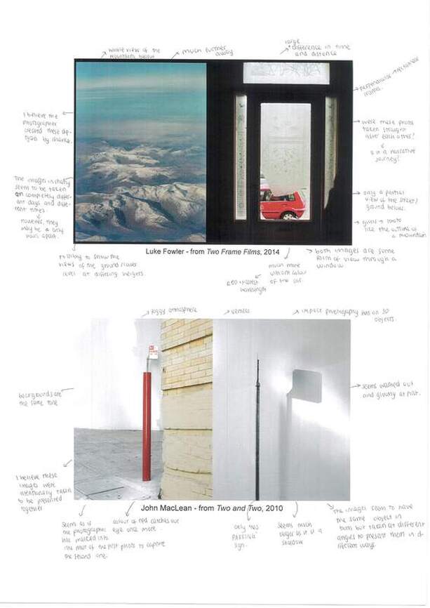
With Luke Fowler's 'Two Framed Films', the diptychs created aren't always deliberate and many of them are paired together by chance. To create his series of photographs, he used a half frame camera, meaning the camera allows the standard 35mm frame be exposed to two shots instead of the regular one. This means that there are two images on one frame together (usually a roll of 36 exposures is 36 images, however due to the half frame camera, it produced 72 images) which is evident through the black line between the two images in his diptychs. Due to such a large number of exposures, he was often unsure as to which photos would be paired together as many of them were taken with a significant amount of time between them. However, as shown by the first photo, these images could also be captured within seconds or minutes of each other, creating an obvious paired diptych.
|
Fowler's diptychs specifically reference to the 'theory of montage' which originated from Russian film-makers in the 1920s, a prime example being Sergei Eisenstein. Eisenstein's work is explained well through the video below:
|
|
Luke Fowler and John Mclean's diptychs
Here, I analysed two diptychs and expressed my ideas as to whether they were paired by chance or deliberately.
John Maclean - an experimental photographer based in the UK
    |
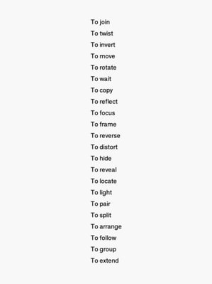
In John Maclean's series 'Two and Two', he photographs using his list of instructions (which is shown under this section). His inspiration was due to the rediscover of his interest in Robert Rauschenberg's collages, more specifically his his twin paintings (Factum I and Factum II). Maclean's work interests me particularly due to the conjoining of objects two images, such as the second example given.
|
Diptychs based on John Maclean's prompts
In class, we were given a list of prompts for our diptychs.
|
TO FOCUS
|
TO REFLECT
|
|
TO REVEAL
|
TO MOVE
|
|
TO LOCATE
|
TO HIDE
|
|
TO ROTATE
|
TO WAIT
|
|
|
My own diptychs
With these specific diptychs, I deliberately paired two of them and the other two were completely by chance.
CHANCE |
|
|
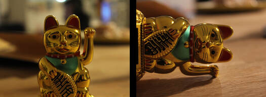
With this diptych, the images were paired together by chance. I let a family member pick a number from 1-15 and let another pick from the same range. Each of the images correlated to a number and these were the images that were chosen. I personally feel as if there isn't very much of a correlation between these two images, although I like the low exposure in both of these images.
|
|
DECIDED |
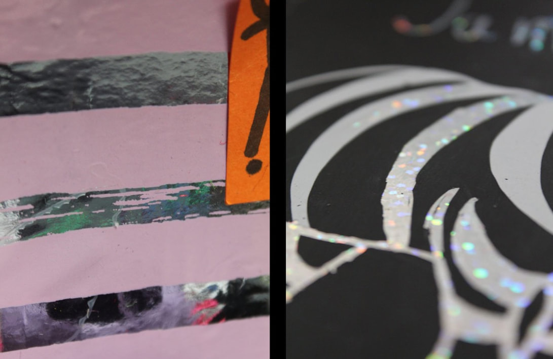
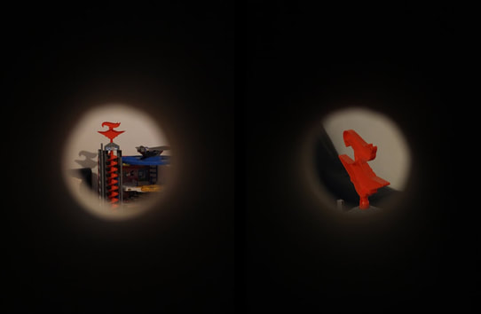
With this diptych, I took these images with the intention of pairing them together. In both of the images, there seems to be a figure, however in the first image the figure is only a head and eyes and the second is only a body. I feel as if these correlate well as they remind me of an incomplete puzzle as they almost match to create an entire person. As well as this, the colours of the box in the first image are different shades of purple and pink, which is similar to the pink material covering the top portion of the second. One other link I realised was the complimentary colours in the images of red and green. Through the hole in the cardboard, there is a red watermelon, with a strip of green for the skin, which juxtaposes the green on the sticker in the second photo (although the strip of green on the watermelon pairs well).
CHANCE |
|
|
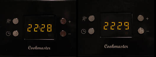
With this diptych, I was initially stuck onto how they correlated with one another although there are similar colours in each. In both, there are blues and reds, although I currently cannot find other links.
|
|
DECIDED |
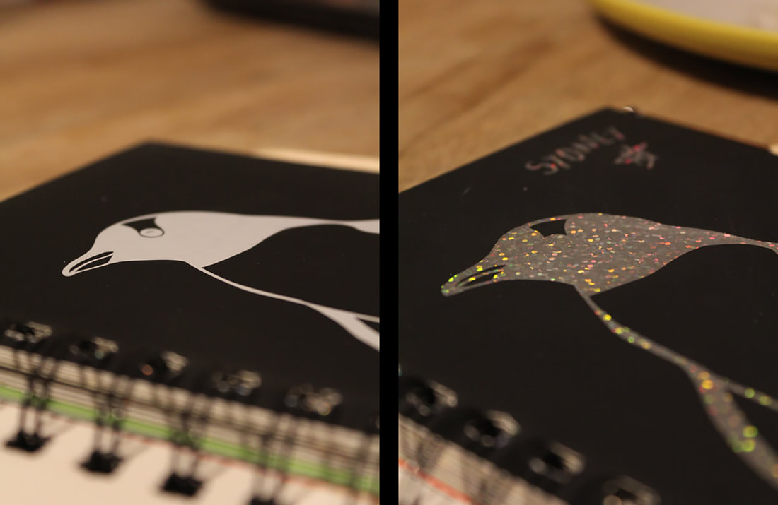
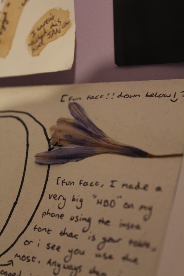
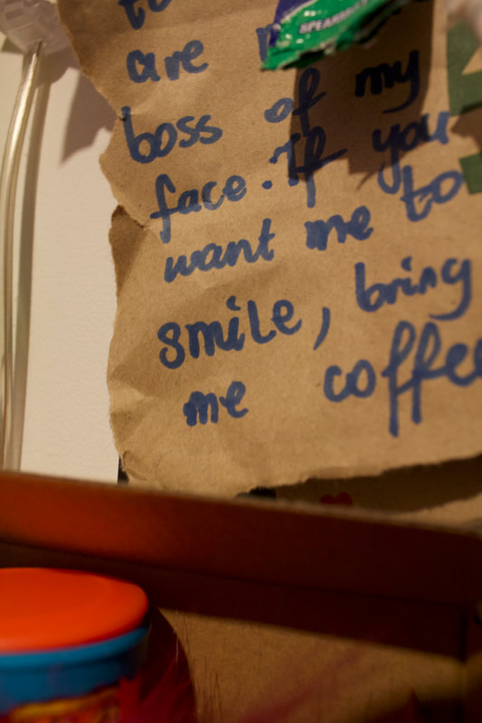
With this diptych, I decided to pair them as they both contain a message but in particular, they are juxtaposing in their tone. The image on the right has a focal point with the word "sadness" and the second image has a general tone of happiness due to the focus on the word "smile". Both of these images were taken in close proximity of each other which, in my opinion, creates a greater contrast between the two images whilst still linking them together.
Overall, I much prefer creating and choosing my own diptychs however I like how there is a possibility for the images to pair nicely without consciously choosing to do so. Possibly, if I had taken a greater range of images, the chances of them correlating would have increased and I believe that I would've preferred to randomly match them.
Katie Olinsky - a photographer based in New York City and Alaska
|
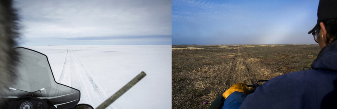
With Katie Olinsky's Alaskan 'The Spring Thaw' she creates diptychs by pairing photos of the same scene but photographed at different times in the year where they look opposing. I personally find this interesting as I like how different the same area of land can be, simply due to the different seasons in the year.
|
|
