John Szarkowski - Mirrors and Windows
John Szarkowski's book named "Mirror and Window's", he presents photographs as either a mirror or window, although he mentions that many were similar through his statement:
The intention of this analysis has not been to divide photography into two parts. On the contrary, it has been to suggest a continuum, a single axis with two poles. Many of the pictures reproduced here live close to the centre of that axis, and can at the reader's pleasure be shifted mentally to the other side of the book's imaginary equator. - John Szarkowski
Here, Szarkowski explains that many of the photographs were similar and were, for him, difficult to make a decision. Due to this, he has stated that we, ourselves, have the ability to make our own decisions as to whether a photo lies closer to either a mirror or a window on the spectrum. The way that the photographs have been arranged in the gallery aren't final, they are simply his own decisions. In the gallery, which was the first ever gallery that accepted photography as an art in New York, the walls were painted either white or grey in order to differentiate whether an image was a window or a mirror.
Consciously deciding whether an image is a mirror or a window
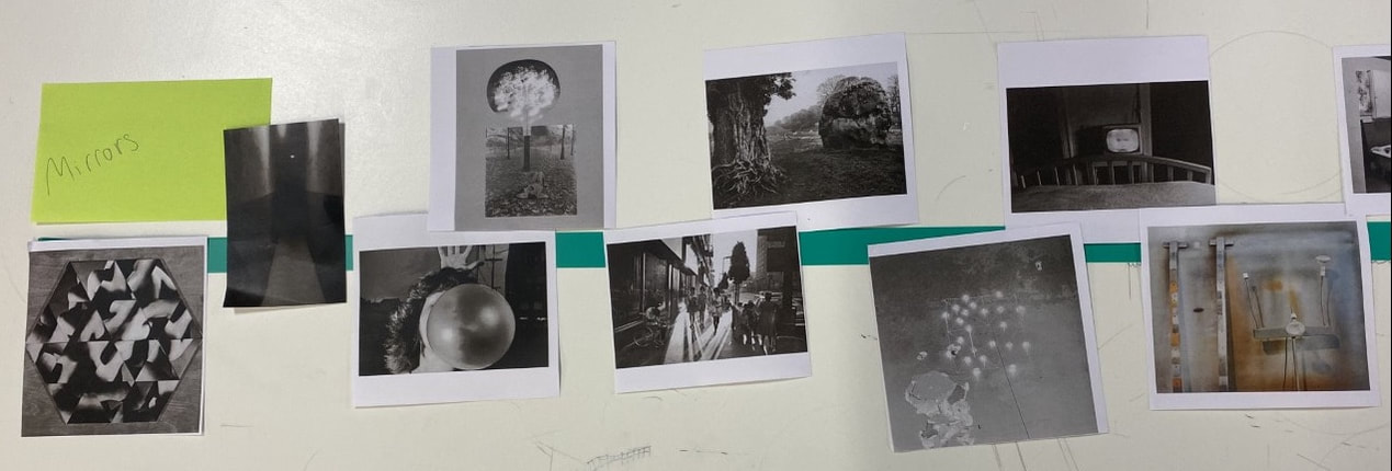
We were given a set of photographs and we had to order them on a timeline with 'MIRRORS' at one end and 'WINDOWS' at the other.
This was our process:
This was our process:


|
I believe that this image relates most to a mirror compared to the others as it is literally presents a mirror in the photo. In addition to this, it reflects the artificial light on it.
|
|
I believe that this image relates most to a window as it simply presents life as it is through the lens of a camera. There is no physical reflection of it and it doesn't reflect much except from the sky at the time. Other images reflect how life was at the time and it gives us information we can interpret from this era, much more than the image of the sky.
|
|
My interpretation on Mirror's and Windows
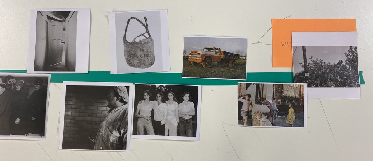
We were asked to photograph ten images of our interpretation of a mirror and ten images of our interpretation of a window.
This is what I produced:
This is what I produced:
MIRRORS


WINDOWS


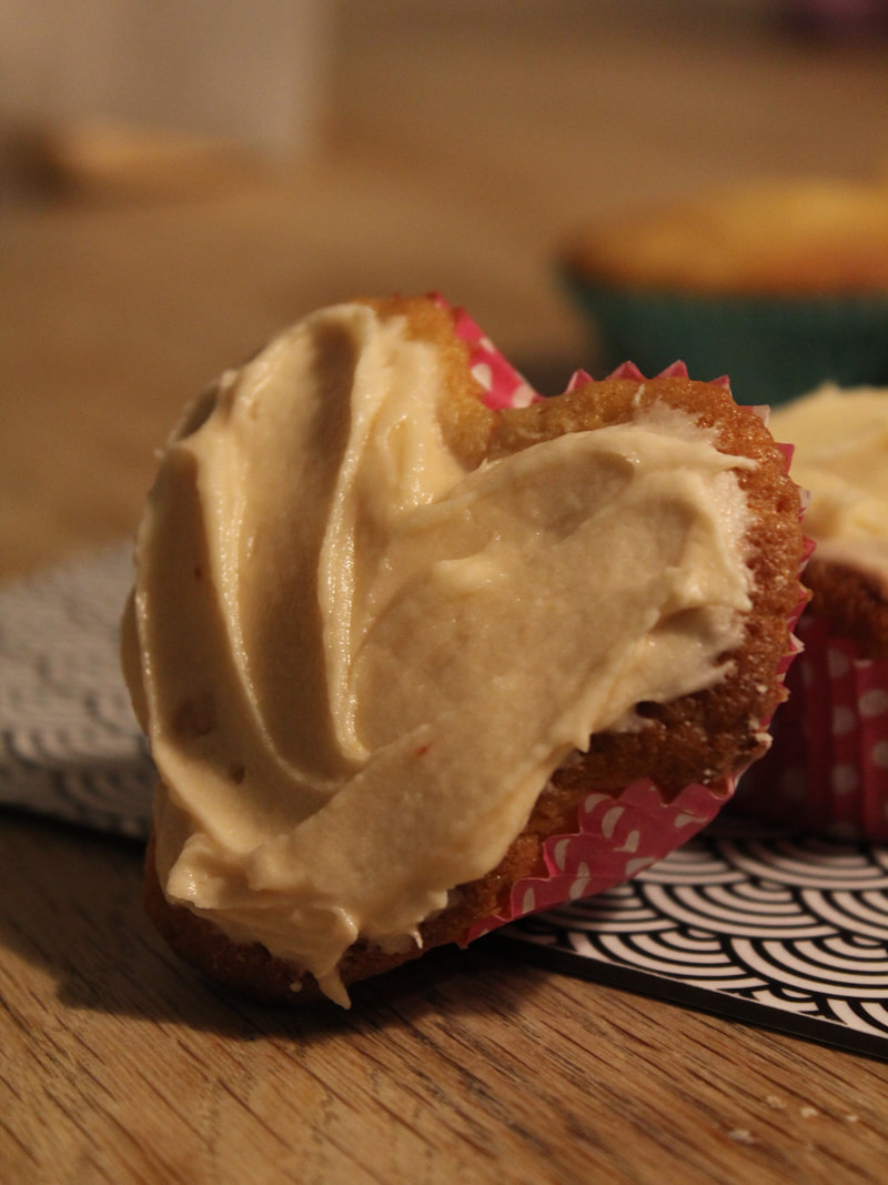
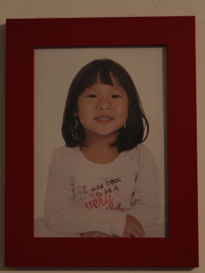
When photographing these images I found it difficult to differentiate between what I considered a mirror or a window. This was due to the fact that I took many of these photos at home, which for me, is a place that mirrors myself well as a whole. However, I decided to simply take photos of things that I felt as if didn't have any significant meaning to me at all, such as the screen including anime and the view through a window in Eltham. Despite me feeling as if taking photos for the term 'Window' was more difficult, I ended up having more photos for it than 'Mirror', since I kept feeling afraid I wasn't going to have enough. Overall, I feel as if these images were relatively successful as initially I was unsure as to what I should include in my images. I particularly enjoy my series of photos for the 'Mirror' aspect as they feel incredibly sentimental when viewing them, especially the photo of me as a child and the heart-shaped cupcake.
|
|
These two images are most significant, for me, as I feel as if they are simply a complete reflection of me, without being too much. The image of the cupcake expresses my creativity and love for baking, as well as my kind-hearted nature as a person. Although to some it may be 'just a cupcake', it really mirrors my personality and passionate traits. The overall hue of the image is quite warm, which seems friendly and just heartwarming. In addition too this image, the image on the right most definitely reflects the changes I have undergone since a child. When I view it in particular, I still see this version of myself in me and it makes me think about the nostalgic memories which have formed the person I am today.
Jiro Takamatsu - Photograph of Photograph
|
In Jiro Takamatsu's series 'Photograph of Photograph', Takamatsu hired a professional photographer in order to capture snapshots of his family album. Due to the fact that he didn't capture the images himself, is one of the reasons that Takamatsu does not consider himself a photographer, yet he is the artistic idea behind the images (signifying that this is still his work, although he did not capture any of the images himself). Some argue Takamatsu intentionally created this distance between him and the photos in order to ensure the outcome lacked bias in any way. Takamatsu could have easily taken these images, but purposely chose not to. In these photos, there is a light (natural or artificial) that reflects onto the glossy topcoat of the images, leaving a glare. This makes the complete images difficult to perceive, which may suggest these photos are up to a viewer's interpretation.
|
|


My images inspired by Jiro Takamatsu
We were instructed to capture our own images influenced by Takamatsu's series of photographs.
|
|


With these images, I attempted to include a variation of elements which are in Takamatsu's images, such as a lack of uniformity with the images, a personal connection to my family photo album, the reflection of light on the images and an individual holding each of the images. When setting up these photos, I had the intention of having the person who was holding me in the image displayed to hold the image as I photographed them as I felt like it deepened the emotional connection towards the image (although that was not what Takamatsu did, I prefer to have a deeper connecting factor in my images). For example, the first two images were my older sister holding me as a baby, and I instructed her specifically to hold the image. I personally feel as if it includes a sentimental value to my photos and continues to express my life through my photography. With the sixth image, there were other individuals in the photo so I attempted to use the light to censor the intended focal point in order to focus on me and my mother. This, I found quite difficult to do as it was irritating to angle and position the hands of my mother as well as the camera in order to cover up the right part in the photograph. Overall though, I feel as if it was successful as when looking at this image, my eyes immediately shift to my mother holding me as a child. With the final two images, I wanted to hold them myself and I chose images where I was alone and supporting myself, meaning I was in my own hands (relating to why I held the image). Once more, I found this difficult to do as I had to photograph with one hand and focus with one hand, whilst attempting to hold an image still, however I am pleased with the outcome. Furthermore, when photographing the the photos from my family album, I attempted to make the background correlate with the background in the image as I felt as if it would make it more easy on the eyes (for example, matching colours or temperature). If I were to re-do this specific series of photographs, I would like to instead take images where I am slightly older and I am outside at a park or a known location to me and photograph myself holding the photo in roughly the same location. This would act as a mirror as it would reflect me in the location when I was younger and me now, which adds a nostalgic feel to the photos (which I think is an important factor in my photography).
Robert Parkinson - a Manchester-based photographer
|
Robert Parkinson's project named "Rear Window" experimented with a limitation of only taking images through a single mirror, as well as these photographs being taken during the covid pandemic. With these photos, there is a continuous element of restriction which can sometimes be a limitation, but it can also create well thought out images. His limited area of space allowed him to experiment with the fundamental aspects in photography, such as: subject, light and composition. Despite each of the images having the same vantage point, the images fail to be repetitive and the same. To create his contrasting images, he uses elements such as: shadow, texture and abstraction. Parkinson stated that "he photographed to maintain sanity and to explore and deconstruct something he should know like the back of his hand: his own home and surroundings".
|
|


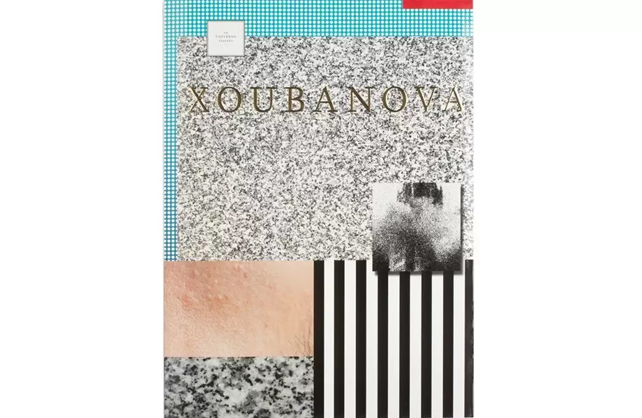
Antonio M. Xoubanova - Un universo pequeño
|
The photobook I decided to research and look at was Xoubanova's "Un universo pequeno". Initially, I was unsure as to how the text and the image sizes were related, however after looking at it for a longer period of time and in more detail, I realised it was the shutter speed that correlated to the size of the image on the page. If the shutter speed was higher, the larger the image size, which in some cases resulted in the image being displayed across multiple pages.
|
|
