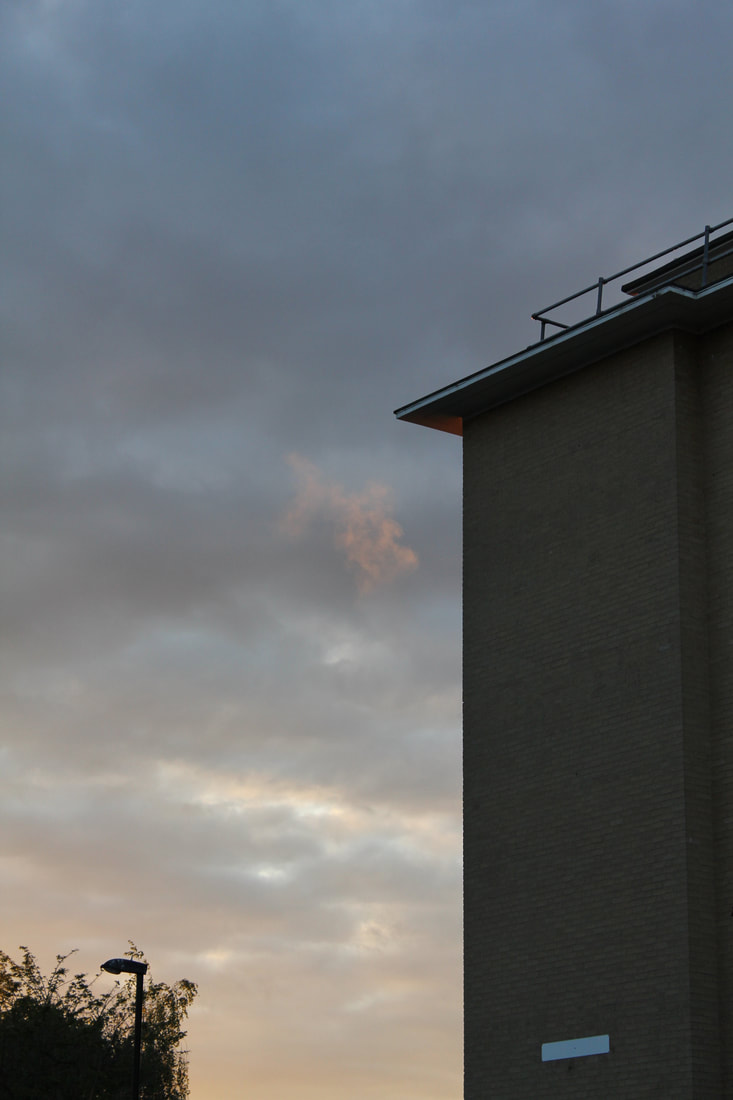
For my photobook project, I have decided to take images based on the idea of 'The Grey Area', which I discovered and experimented with previously in this course. I became incredibly fond of the idea of photographing the mundane things that the majority of people disregard or have no interest towards. I prioritise the actual subjects that appear in the image, over the colours, lighting and composition.
Photographs inspired by 'The Grey Area"
These images were taken throughout the half-term on the days I went out and simply took images of things that caught my eye.


Conducting a 'Dérive'
The 'Theory of the Dérive' (the French word for drift), is one which involves a playful-constructive behavior and awareness of psychogeographical effects, and due to this, contrast from the classic notions of journey or stroll. When conducting a dérive, there should be no thought as to where you are leading yourself to and non of the decisions whilst photographing, should be pre-planned or considered deeply. In simple terms, all that is required is an initial thought and the ability to direct yourself based on one single instinct. There should be no boundaries or no limitations during this process. Although a dérive is occurs in small groups consisting of two or three individuals, one can dérive alone.


Whilst conducting my own dérive, I remained in an area which was familiar to me, but I ventured out to areas that I usually don't choose to explore. I surprisingly felt really comfortable taking these photos and during this shoot in particular, I was interested in specific colours that stood out to me and random things that a person wouldn't typically see. Since starting this project based on 'The Grey Area', I've realised that I have a much keener eye for things that other people simply do not realise are there. When taking photos of general litter on the ground, people stared at me and looked at me in confusion but I ignored them and continued to do what I was doing. Although taking images of cans on the ground and plastic bags may seem strange to another person, I am interested in it and it does not impact another person. I rarely take portraits as they personally are not my style or interest me, but a green can on green grass does. A 'good' photo, is most definitely subjective.
For my next dérive, I plan to experiment with black and white images, as well as going to a completely unfamiliar location for me as with these set of images, I knew my surroundings quite well and I feel as if that influenced the directions I walked and every turn I took.
For my next dérive, I plan to experiment with black and white images, as well as going to a completely unfamiliar location for me as with these set of images, I knew my surroundings quite well and I feel as if that influenced the directions I walked and every turn I took.
Second Dérive


For the second dérive that I conducted, I went to a place which was familiar to me but not at its current state. I began my journey by going on a bus which would originally take me home but then I decided to stay on the bus for half an hour more to see where I ended up. This is where I decided to conduct this set of photos. I initially started in New Cross and walked around the area, simply taking images of things that caught my eye or that I felt was out of place (as I usually do). I walked to deptford, still taking images of similar things. This time round, all the decisions made were impulsive and not thought out previously and I felt as if I was more drawn to lighting. After reviewing and looking at my photographs carefully, I realised a theme of brighter lighting and more duller lighting throughout the series. Each of the images appear in the order that they were taken, but due to darker lighting in some previous to more lit up photos, they seem out of place. An image that describes this completely is the eighth one with the unlit bulb being directly next to the lit up one (which is a personal favourite in this series).
Photobook styles
Personally, I would like to create a photobook that is handmade in some form as I feel as if photography should include a personal aspect to it, which could be portrayed through simply the photos taken, the arrangement of them, or both. I would like to present my passion for art through this photobook, as well as my passion for photography, almost a fusion of the two. Therefore, I feel as if a handmade photobook is ideal for me, however, I may still experiment with a generic printed photobook.

Dos-à-dos binding
One design that interests me is creating a photobook with two individual books in one. I feel like it adds an extra aspect of curiosity for the viewer and simply makes the photobook more interesting in general. With that thought in mind, I decided to research a style of binding called 'Dos-á-Dos' binding. This appealed to me because I wanted a theme of inside outside, but to develop it further, I wanted it to be an inside and outside perspective of my personality and essentially my interests.
One side of the photobook would be the evolution of my personality by presenting the household I grew up in and the cultural elements that created the person that I am today. This side is influenced by our previous project of 'Postcards from Home', which I became fond of as I feel as a person's personality should be underlined through their photos. In particular, I would like to take inspiration from Delfina Carmona as her work makes me feel at ease, as well as nostalgic. The nostalgic and simply pleasing feeling that I receive from her photos is something I would like to mirror in my own work. Then, the opposing side would display my interests through what I decide to photograph and the type of things that intrigue me and essentially what I focus on when on a journey or simply walking down the street. This would allow the viewer to see what catches my eye and allow them to spot the specific things that I spot, as they aren't typically what people are drawn to.
With the design of the photobook (not the content of the images), I was researching how I wanted to stitch/bind the book or whether I want to print on demand. I feel as if ideally I would prefer to have a completely homemade book, although I also like the cleanliness of a printed book or one that is not made by hand. With these thoughts in mind, I feel as if combining a book that is printed on demand and a hand-made aspect to it would work well. The hand-made aspect would be the stitches that bind the cover to the pages of the book, and I would like to have a soft but not completely smooth material as the cover (for example a linen type of material). Continuing with the theme of material, I'd like to have a mix when referring to the pages in my photobook. Examples of these would be glossy printed paper, card, fabric and regular paper with a stain (either teabag or watercolour paint). The print on demand aspect would be the actual pages that contain the images. In terms of the binding, I have found two ways which I would like experiment with and one of which would be the designated design for my final outcome. One set of instructions that I will be following is for a 'hemp leaf' style of binding (the last tutorial) as this design looks simple, yet it isn't too plain. The other design is quite similar to the previous one, however instead of the straight line separating the design and the front cover, it is essentially a zig zag, which makes it slightly more difficult to do but looks more creative.


One final idea that I would like to incorporate into my photobook would be inserts such as origami or a range of photo inserts printed on a different type of material (one of the ones previously mentioned when describing the pages). Another type of insert would be either random origami instructions to separate the photographs in my book or even a written letter or menu of some-sort . I feel as if this would continue to underline the creative side to me and it would complete the book well.
Exploring artists similar to my ideal photobook
As a part of research for my photobook, I am researching artists that have a similar style as to how I want to layout and create my photobook.


Rink Kawauchi & Terri Weifenbach - Gift
With 'Gift', I was inspired by the layout of the two photobooks, as well as the irregular placement of the images and the sentimental meaning towards the two sets of images taken by both Kawauchi and Weifenbach. In terms of layout, I liked the fact that the photobook contained two separate books that were conjoined as one, which links to the Dos-á-Dos binding I researched previously. One side of the book is the sequence of photos that Kawauchi took living in Tokyo, Japan and the opposing side are the photos taken by Weifenbach living in Washington D.C, USA. The pair exchanged their photographs over an extended period of time through their emails which were considered gifts by the both of them. Through their images, a subtle narrative of their friendship is displayed, despite their physical distance apart.
Andy Feltham - Incidental View & Nicky Hirst - It is something | It is nothing
With both Feltham and Hirst's book, I was inspired by the composition of their images, the contents in their image and the layout of their photobook (especially Nicky Hirst's decided diptychs). I like the simplicity of their images, and the way they display the world in a different light. An initially 'simple' image of a fence or a brick wall has the ability evoke emotion, which something I wanted to convey through my images. Personally, I feel as if their images link relatively well with my idea of the 'Grey Area' theme. At first, I questioned why they created this image and decided to print and produce copies of these series of images, which led to me in an area of uncertainty.
Experimenting with layouts
To create these layouts, I used an application called 'Bookwright' to choose the images I wanted to include in my photobook, as well as experimenting with the sizes of the images, which images I should include and the regularity of the layout.
Layout One
With this particular layout, I wanted to vary the perspectives that I included and create a sequence with the different ones.

The order of the viewpoint perspectives


Layout Two
With this layout, I wanted to pair the photographs I had chosen into diptychs or a double page singular image. I believe that this layout is more successful than the previous one as it makes you think more about why the images are placed next to each other and it places the viewer in their own version of 'The Grey area'.


Physical copy of my photobook


In order to create this physical 'mocked-up' version of photobook, I used an application named 'Bookwright' to decide on a layout which I liked and once I had decided that, I printed out screenshots of the pages. I stuck the pages together with glue to create a stable spine. So I could bind the together and for it to have a strong enough spine, I simply stitched a sugar paper cover on the outside to the middle pages of the book, then I folded and placed the dusk cover on top. However, I would still like to include some form of Japanese binding into my work, so a dusk cover isn't ideal. My next plan is to split the dusk cover in half and bind it like it is a page of the book.
French link stitch binding
I followed this video in order to bind my book:
My first attempt
With this attempt, I rushed and didn't follow the instructions properly.


My second attempt
With this attempt, I followed the instructions properly, however due to the difference in page size, it wasn't straight.


Maquette version of my photo book


With this version of my book, I wasn't particularly pleased with the outcome. I enjoyed the process of hand binging my book with the French link stitch binding style, however there are many imperfections that I'd like to improve, for example making the pages the same size (which seems obvious, however since I had to cut the paper myself, they weren't). I feel like my idea has been finalised and these practices have given me a clear idea as to what I want my final outcome to look like.
