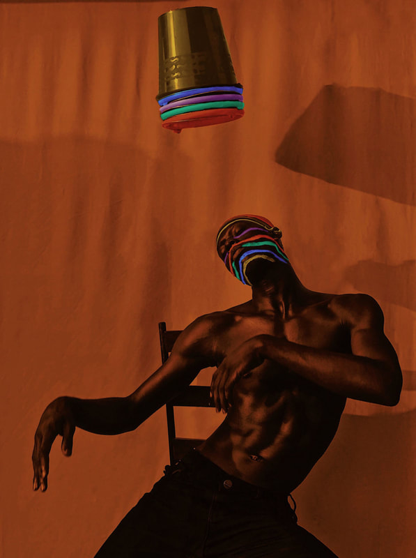
Aïcha Fall - a pioneering photographer
Aïcha Fall uses photography as a way to explore her identity and continuously links back to her culture and personal traditions through her practice of art. Fall has a passion for photography's narrative power and communicates to others how photography can be used to transform the world. In addition to this, she ensures to embrace the responsibility that follows when actively representing one's culture, continent, heritage and community. With her work, she uses items from her current surroundings and transforms them into pieces of art, which she then expresses through photography. Her work is displayed in Studio Yinka Shonibare, Keywest fotofest , La Terrasse Paris and Abidjan Côte.
'A SEAT AT A TABLE'

|

|
Both of these images are from Aïcha Fall's collection of photos named 'A seat at the table'. Through the images in her collection, she tells a visual tale which invites us as viewers into this altering dimension.
With the image on the left, we are presented with a portrait of a woman who seems to be glistening with a purple tint on her skin tone who is wearing a metallic material as clothing, as her braided hair is spread on the table and holding a glass which seems to be filled with golden beads. The table is covered with a red table spread and on it, there are more golden beads which vary in size. Immediately, my eyes are drawn to her intense glare towards the camera and the fact that she is directly in the centre of the image. Clearly, she is the focal point of the image and her authority here is set straight away. The contrast between the warm hue of the background and the cold hue from the purple clearly emphasises her dominance and her power, which is further underlined by her body language and posture. Gold is rife in this image, presenting this woman in power possibly as the epitome of wealth and prosperity. Her presence almost seems supernatural, due to her hair encapsulating the glass as if it was a third had. Perhaps Fall staged this image in order to voice the power and dominance women can obtain in society, by intensifying each element in this image which bind together to create a strong message.
With the image on the left, we are presented with a portrait of a woman who seems to be glistening with a purple tint on her skin tone who is wearing a metallic material as clothing, as her braided hair is spread on the table and holding a glass which seems to be filled with golden beads. The table is covered with a red table spread and on it, there are more golden beads which vary in size. Immediately, my eyes are drawn to her intense glare towards the camera and the fact that she is directly in the centre of the image. Clearly, she is the focal point of the image and her authority here is set straight away. The contrast between the warm hue of the background and the cold hue from the purple clearly emphasises her dominance and her power, which is further underlined by her body language and posture. Gold is rife in this image, presenting this woman in power possibly as the epitome of wealth and prosperity. Her presence almost seems supernatural, due to her hair encapsulating the glass as if it was a third had. Perhaps Fall staged this image in order to voice the power and dominance women can obtain in society, by intensifying each element in this image which bind together to create a strong message.
I wanted to narrate black bodies capable of doing wonders, or just black bodies existing simply and beautifully - Aïcha Fall
|
|
|
Delfina Carmona - a photographer from Buenos Aires, Argentina
|
Delfina Carmona is a photographer and art director who is currently based in Berlin, Germany. With her background of theatre and a career in professional photography, Carmona has dedicated herself to creating the scenes she photographs. In each of her photos, she interacts with objects and the light, as well the shadows formed. Despite using a minimal number of materials and objects which aren't perceived as luxury nor anything special, she creates images which evoke a homely atmosphere and are pleasant to view. Many of her photographs are self-portraits that reflect her as an individual and her personal experiences with the compositions of light, colours and shapes.
Whilst experimenting to find her true connection with each of these aspects, she has worked and collaborated with several brands and other projects in general around the globe. |
|


I live a love story with light and colour. I look for beauty in everything that surrounds me - Delfina Carmona

With this portrait photograph, Delfina Carmona is the main focal point and she seems to be becoming a part of her covers and bed, as her sheets are wrapped around her in a tight manner while her face is completely engulfed in her pillow and its cover. Her background is white, her sheets are blue, her t-shirt is a hue of red and her glass filled with juice is orange - each of these colours are solid colours with no variation. This solidity could represent the lack of change which can occur whilst being isolated in the home and the regularity of each day as they pass. The red and blue are contrasting colours due to the warm hue of the red and the cold hue of the blue, this may reflect her as being the sole sense of life in her household. Her covers are tightly wrapped around her torso and it seems as if she's becoming submerged into her bed and becoming part of it. Her sheet almost taking over her entire body and it restricts her from escaping her bed. Possibly, she may have done this in order to present the lack of freedom being at home as prominent.
My take on Delfina Carmona's work:


In each of these images, there is a light reflecting on the wall which was coming from the sun through my door peephole. I took this as an opportunity to take images experimenting with light and shadows. One thing which is consistent in these images that I dislike is that the background wasn't a solid white colour since I was unable to change where the light was directed but I still captured the images anyways. I was inspired by Carmona as in one of her photographs, she has her hand around the flowers yet you cannot see her hand in close proximity in reality. This idea fascinated me which is why I attempted to recreate it in my own way. I personally really like when you can see the colours of the white light reflecting on the flowers, as well as the background. For me, it is incredibly pleasing to view and I'm proud of the outcome. If I could edit the images in any way, I'd remove the background and replace it with a plain white wall as I feel as if the shadows would stand out more.
Larry Sultan - an American photographer
|
|


Larry Sultan began his career as in the 70s as a conceptual photographer and throughout his later work, he began to focus on the atmosphere within his suburban family home. His 'Pictures From Home' is a narrative collage which explores the ambiguity of the boundary between a genuine realistic image and a staged image. These photos were captured between 1982-92 and during this project, Sultan felt some form of betrayal towards his parents due to his supposed breaking of trust as he displayed these private images online. However, to combat this, he got them to agree to collaborate with him to create these images and state that they had discussed these images beforehand and 'dismantled [his] position'.
I want my parents to live forever. - Larry Sultan

|
In this image taken from Sultan's series, his parents are communicating with each other whilst in different sections of the room yet not being too far apart. His mother is on the sofa whilst leaning on the back of it facing his father, who is sitting at the dining table about to grasp his glass of wine. The room is almost entirely a lime green colour and the walls are white but have designs of flowers and palm trees in the same shade of green. Furthermore, the carpet (in the same green) has darker marks in it, due to being it being stepped on or things dragged across it as it is a material where the colour darkens when moved in an opposing direction. For me, this image brings a sense of nostalgia and humour as it reminds me of my grandparents and their home designs, as well as the body language displayed as they're communicating with each other. The vivid shade of green may also represent the continuous life of their relationship and its interesting nature.
|
Images that represent my home:
We were told to take images that simply represent our home.
This is what I came up with:
This is what I came up with:


For these images, I didn't have access to a camera other than my phone which resulted in the quality not being the best, but the contents of each image, for me, really encapsulate my environment at home. I attempted to order them in a way where they reflected the journey you would take in my household and the order you would see things as you walk in. Whilst photographing these images, I didn't focus on any specific aspect of my household, I simply photographed anything I saw in my home which I thought embodied my the essence of my home. These photographed things consisted of people in my household, food, other photographs that are displayed around on my walls and cupboards. I attempted to display the asian culture of my home (mainly though the images of the food) and the familial feeling people gain as they enter my household (due to the images of my siblings and parents framed throughout each room). With the images of members of my family, I had previously mentioned that I'd be taking images randomly and they agreed that I could publish them, as long as they were content with the image. I feel like to improve these images, I could used a camera other than my phone and I could've edited them in a way it felt more warm and cosy by making the photos have a warmer temperature. Although, the natural light and unedited vibe throughout the images act as a pleasant feeling for me as this is how I view my home; it is bright and the harshness of the light represents the vibe of our home on a regular day.
Frank Frances - a Brooklyn-based home and still life photographer
|
|
I’ve grown up with a certain amount of prejudice in some ways. So I make work in some way to help me work through that. - Frank Frances
|
Frank Frances uses photography as way to relate back to his childhood and his memories. His work relates to the theme of 'home' as the food and objects act as a reflection of his nostalgia with his grandmother and mother cooking in the kitchen together. His objects have been specifically chosen in order to explore the 'frustrations of the nuanced variability of racism and their historical and current implications today'. He embeds elements of racism and stereotypes in the American South by including objects and symbols such as confederate symbolism through his art, cotton and traditional soul food ingredients (like yam). Frances has been inspired by other artists such as: Gordon Parks, Roe Ethridge and Mickalene Thomas.
|
|


My response to Frank Frances:


The objects I chose to use were noodles, a persimmon fruit, a pumpkin. an origami swan and a glass vase. Initially I found it difficult to photograph these images because I didn't have an idea as to how I wanted to arrange each object, I only knew that I wanted to include the noodles in each photo. However, I started to just experiment and arrange the objects in a random manner and photograph it even if I wasn't completely happy with the outcome. For the first image, I attempted to use a yellow background, however it was difficult to photograph and I felt like the yellow packaging didn't stand out which wasn't ideal. The second image along is the image I was least happy about as I dislike the yellow lighting and I couldn't combat that with the camera. If I were to edit the image and make decrease the warmth of the image, then I think I'd have been more pleased with the outcome. With the last four images, I used the natural light and changed the environment I was in. I much prefer the darker vibe as it makes the objects seem more visible and pleasing to the eye (from my perspective).

In this image, the origami swan is in the centre and acts as the focal point whilst in a sea of instant noodles and fruit. Despite not initially having much impact on others, it does to me. The swan seems as if it is swimming through and this relates to my parents having immigrate by boat through the sea and for me, instant noodles are a large aspect in our household. It is a staple for many asian households as they're convenient and the persimmon fruit reminds me of my childhood with my grandparents. Without fail, every time I have visited my grandparents, they ensure to have a fruit bowl containing persimmons. As a child, I would watch my grandmother peel and slice one for me to eat, which acts as a nostalgic memory for me. On the packaging of the noodles, there is red and yellow. These colours represent my nationality as they reflect the colours in the Vietnamese and Chinese flag. The patterned cloth in the background once more reminds me of my grandparents as in their home, they have an array patterned material and clothing and this could easily be one of them. I believe this is my most successful photograph as it includes the three objects which I could relate to and personally for me, it embodies many aspects of my life and culture.
Collaborative still-life
We were instructed to use our personal items (as a group) and to create a still-life and photograph this set up.


When taking these images, our group decided to begin with an artificial white lamp in order to highlight the objects and brighten the scene, however we quickly changed to using a colored filter. This was done in order to be able to incorporate the other non neutral object in the scene. The images that allude to me the most were with the blend of clear, colored, plastic film as they created a film with a chrome like feel to them as the background. With the arrangement of the chosen objects, it made me imagine a market stall in foreign countries due to the randomness of them as well as some form of desert. For me, the only restriction was the fact that I remained in roughly the same position and angle as I did not want to obstruct the images that the other individuals were photographing. For me, working with other individuals was more enjoyable as they had more ideas which I would have come up with (such as using coloured film), and I personally like those photos the best.
Images that represent my home (2)


As I did previously, I captured images from throughout my household and ones I believe capture my household well as a whole. This time round, I included more objects and food which have a connection to my culture as I feel this adds more of a personal level to my photography. Honestly, I feel as if this particular series was more successful this time round, as I prefer the lower exposure in the images although the first couple images were difficult to take as for some reason I would only take photos in only artificial lighting (as each of these images were taken in the evening/at night). In addition to this, I decided not to include any portraits of my family as they preferred to be excluded and personally, I don't feel as if they were necessarily successful images either.
Final set of images


I chose these final set of images as I feel as if they express my culture and household well. I went through the route of displaying my household's food and I was partly influenced to capture these due to my family's love of food. I was inspired by Frank Frances' expression of his home through his display of food from his heritage. Consciously, I decided to do similar things, however I presented them in a different manner and there was no chosen composition with these images.
Diptychs from my series of photos
The first diptych created is images 1 and 2, then the second is images 3 and 4 and so on.

With the first diptych (images 1 and 2), I decided to pair them as they both contain a white starch and they're both staples in an oriental asian household. I feel as if they work well together as they are very similar as to what they show and the colours included in the images.
With the second diptych (images 3 and 4), I paired them together as they both contain a similar shade of red and they both have clear Chinese characters. The images were both shot in low exposure and I feel as if they simply correlate well.
With the third diptych (images 5 and 6), the images are displaying a different type of curry and both images have correlating colours within the packaging. One other linking factor between the two images, which at the time I didnt realise, was that both of the labels include a colour. With image 5, the label says 'Golden' Curry and with image number 6, the branding is 'Blue' Dragon and the name of the particular curry is Thai 'Green' Curry.
With the fourth diptych (images 7 and 8), my intention isn't immediately obvious however I paired these images as the oil in the bottles have usually been used to fry the spring rolls however I feel as if the colour of the oil pairs well with the warm temperature of the image and the colour of the food.
As a whole, I feel as if these diptychs all combine and work well together as I feel as if they display my home life in a truthful manner. For me, food plays a large part in our household and that is the aspect I wanted to expose through this series/collection of images. If I were to improve on something though, I'd try and make my images more intriguing as I feel as if they are quite plain.
