Initial ideas for my personal investigation

A mindmap of my potential projects
Before the summer, we were set with the task of researching and discovering what we would like to investigate in order to complete our personal practice, including the possible themes that we would like to appear in our work. With my personal investigation, I have decided to continue with the theme of 'The Grey Area', but also explore the aspects that make a photograph visually pleasing. Photographs have their own visual language and grammar (TC8), yet people still have a general idea as to how a photograph should be composed, the subject matter, and the overall look of it. I plan to conduct more dérives as I enjoy the element of chance (TC6) that can be included in photography.
Recently, I have been fascinated by the role of editing in photography and what photographers choose to change to make a it worthy of publishing. Why do photographers, disregarding for commercial purposes, feel the need to make their images appeal to the public, and not just for themselves? Alongside this idea, I believe that the temperature of photographs has a large impact as to how we perceive an image so I have decided to research on blue hour photography. I have realised that I have had a tendency to photograph in the evenings, as the sun is setting and the sky is transitioning to a rich blue. This visual preference may be a mirror of my emotions, as many of my images reflect me in some form.
Recently, I have been fascinated by the role of editing in photography and what photographers choose to change to make a it worthy of publishing. Why do photographers, disregarding for commercial purposes, feel the need to make their images appeal to the public, and not just for themselves? Alongside this idea, I believe that the temperature of photographs has a large impact as to how we perceive an image so I have decided to research on blue hour photography. I have realised that I have had a tendency to photograph in the evenings, as the sun is setting and the sky is transitioning to a rich blue. This visual preference may be a mirror of my emotions, as many of my images reflect me in some form.
Summer
Throughout the summer, I captured some images on the few occasions I was able to leave my home. I did not have any ideas that I wanted to explore at the time but I wanted to start off somewhere. In this set of photographs, I didn't have a clear theme that they all related to but from them and looking at Threshold Concept #3 (photography has multiple functions, multiple contexts and meanings and these can sometimes overlap in interesting ways). Though I had not consciously made a decision on anything, these images feel as if they link in some way, possibly due to their random nature. Many of my initial ideas have stemmed from these photographs.


With this photoshoot and after having a conversation with another individual, I realised this unintentional bias towards underexposed photographs and an attraction towards cooler tones. It was suggested that since I was stressed and unhappy during the holidays, it was reflected by my images. Although I am initially more attracted to taking images in bright daylight, I always seem to be lowering the exposure and I still do not completely understand why I do so. I feel as if it makes the colours in a photograph look a nicer shade and with ones taken on my phone, they aren't always accurate as to how I view the scene/subject in reality.
With the few images I have, I am pleased with the outcomes. The images with a deeper blue hue encouraged my research on blue hour photography and learning why at a certain time of the day, the blue in the sky shows a lot darker on a camera than in reality. Additionally, this series of images began my interest in cones and initiated my series of photographs solely focused on cones. Despite them being rife throughout the city of London, they still spark a sense of joy when I see them and I feel called to take a photograph. Lastly, I was influenced by the image of the "Strawberry Local" corner shop, which is a fake version of "Sainsbury's Local" and I realised the enjoyment that I get when I see something so out of place and humorous. I use photography in order to document these things as I know I am not the only one who finds them amusing.
With the few images I have, I am pleased with the outcomes. The images with a deeper blue hue encouraged my research on blue hour photography and learning why at a certain time of the day, the blue in the sky shows a lot darker on a camera than in reality. Additionally, this series of images began my interest in cones and initiated my series of photographs solely focused on cones. Despite them being rife throughout the city of London, they still spark a sense of joy when I see them and I feel called to take a photograph. Lastly, I was influenced by the image of the "Strawberry Local" corner shop, which is a fake version of "Sainsbury's Local" and I realised the enjoyment that I get when I see something so out of place and humorous. I use photography in order to document these things as I know I am not the only one who finds them amusing.
My projects
The following series' of images were intended to explore the ideas that I accumulated after the summer.
Photos that spark the same pleasure
Through this set of images, my intention is to display the contrast between the subject matters that bring me a form of excitement to photograph.


When presenting an image two images to multiple people, typically I know which image people are going to feel more drawn to, simply due to the lighting or focus in it. Due to this, I wanted to present two images as a diptych to show how contrasting the things I photograph are but how two very differing things and outcomes can bring the same joy. I exhibited these diptychs to other creative subject students and teachers and many of them preferred the image that was not a conventionally attractive image, but when presented to the public, the result was opposite.
B&W photography vs colour
With this series of photographs, I wanted to discover whether there was a preference with the image as colour or black and white.


I conducted several polls to compare how images are perceived differently when presented in colour or black and white (the results are shown when the image is hovered over). I predicted that for the majority of the images, people would prefer the coloured version, but the results have proven otherwise. With the images that I believed looked best in colour, the majority voted in favour of the black and white version. It was mentioned that with a black and white image, a person is forced to focus more on the subject photographed as they are not distracted by the vibrancy of different colours. They are able to acknowledge the contents more and smaller details in each of the images are more enhanced. Despite this discovery, I still favour colour as many of my images are underexposed and dark, which would allow the details to be easily seen.
Exploration of cones
Here is my collection of cone photography that I have accumulated since summer.


When asked about why I photograph cones, I never know how to respond as frankly, I cannot explain my interest and fascination with them. Even before I began accumulating these photos, I realised that an image of a cone is present in almost all of my series of photos but I was unsure why. However after much thought, I believe it is simply as in cities and busy areas, cones are incredibly common but they aren't acknowledged at all due to how normal of an object they are. For some odd reason, cones are always misplaced or placed in such random ways and areas. I still do not understand why the general public enjoy to mess around with them but it is always interesting to see where they end up, and I always question how and why they are where they are. With this collection, I started off by focusing on cones in odd places, however I now take photographs when they're damaged or even if I just like the way that they are placed or ordered. Every time I see a cone, I feel the same joy (arguably more) than when I see a sunset or a cute puppy. Now, when someone sees a cone, they send a photo to me or when I am with someone, they point out cones if I haven't seen them yet. I feel honoured that people think of me when they see a cone.
Phenaamina (Instagram)
I became interested by cones when I came across a photographer on Instagram named Aamina.


I spoke to Aamina about her fascination with cones and her decision to photograph and edit them. She stated that she was not initially interested by the bright orange colour of cones that usually catch people's attentions, but instead by a cone "that was falling apart and you could see the reflective surface peeling off", the material was more interesting to her. From there on, cones became a subject matter she focused on in her 'found still life' and she realised that cones are almost like herself "in the scenes and normally blending in but also inherently standing out; maybe something WOC (women of colour) can widely relate to, being very visible". Additionally, something I relate to more, she finds cones amusing. I was initially intrigued by the odd places that I would see a cone or the state that the cone was in. They were never something I initially focused on previously, as they are such a normal part of our lives as we see them almost everywhere in a city like London, but when I started my project on focusing on the mundane aspects of life and giving a purpose and meaning to the disregarded, they became fascinating to me and I could not stop spotting them.
Blue hour photography


When researching about blue hour photography, I realised that it took a lot more thought and planning than my typical photoshoot would. You need to have an idea of what you would like to photograph, however my images are never planned or set up so that was something I was finding difficult to do. Additionally, the amount of time to take an image during this "hour" is not very long, it can range between 20-40 minutes and it can even be shorter than that, making it difficult for me to venture out and find things to photograph. After taking these images, I realised that blue hour photography was not something I wanted explore further as it is difficult to be out at the specific time of day which it occurs. Despite this, I still believe that these images were successful as with minimal editing, the mentioned blue hue is clearly evident throughout. If I were to have continued exploring this further, I would go to places before it begins to get dark so I have other things I can photograph as these images are all taken nearby to me as I could not time myself well when deciding to photograph.
After exploring these different ideas and themes, I realised that I did not want to explore them further as it did not feel natural to plan these type of shoots and I felt as if they did not link to me and my genuine interests much. I prefer conducting dérive's and being able to not know what I will photograph which makes my photographs random and unplanned. The one thing that I continued to photograph from my previous experiments are cones.
General photoshoots
02/10/22


With this particular set of photographs, I walked around Lewisham/Lee Green which is an area I pass through every day but have been yet to photograph as I never have the time to stop and analyse it. I felt as if these images are not of anything that weird or unusual but I was simply drawn to them and decided to document them despite that. I do quite like this set of images as many of them are composed in a simple manner and they are not to difficult to perceive. One thing that I learned from this photoshoot was despite the clear blue skies, which resulted in a nice overall lighting in these particular images, they feel quite boring and I don't feel myself questioning the intentions for pressing the shutter.
28/09/22 - 11/10/22


For this series of images, I feel as if I focused more on the subject matter than the composition or lighting as with the previous shoot, it felt too normal. With these, I am left questioning the context of these images and the ambiguous nature of them. I feel much more pleased about this set of photographs as they feel a lot more connected to me and I feel as if they clearly reflect the variety of interests I have. Taking these photographs has also made me realise how quickly things can disappear or change as within a few days or even hours, none of these images would have been able to be recreated. Many of the things that I noticed are no longer in the same position, simply because they have been physically removed or because they change constantly (like the way the sky looks).
23/10/22 - 03/11/22


With this series of photographs, I simply left my house with the intention to photograph but had no particular intentions with them. Many of them were taken during the evening and as it is about to turn to night, as that is typically when I like to leave my house to go on walks. I have realised with previous shoots that I coincidentally prefer to shoot at night as the photograph does not simply look 'good' because of bright lighting or warm lighting created by the sunset. Although some of these images present this exact thing, they are not the images I consider the most successful. As well as this, some of these images are quite conventional in terms of subject matters. Yet despite this, many of them make the viewer question as to why I subconsciously decided to stop and document it as a photograph. I have continued with my images of cones as I feel as if they will always create confusion when seen and will allow people to attempt to figure out why I am interested in such a simple subject matter.
I am not particularly proud of these photographs, however I am not displeased by them. In general, I struggle when taking images as it is getting darker as I do not want to make the image too grainy by increasing the ISO but I also struggle to stay in the same position when using a slower shutter speed for longer exposure. If I were to re-do this specific photoshoot, I would most likely take many of the images on my phone as the issue with the image being too underexposed is easier to deal with, due to the night mode setting that automatically makes the image brighter when it detects you are in a darker environment. Although learning these setting are important, I currently prefer to focus on presenting the things that I am choosing to photograph, rather than the visual aspect being perfect.
I am not particularly proud of these photographs, however I am not displeased by them. In general, I struggle when taking images as it is getting darker as I do not want to make the image too grainy by increasing the ISO but I also struggle to stay in the same position when using a slower shutter speed for longer exposure. If I were to re-do this specific photoshoot, I would most likely take many of the images on my phone as the issue with the image being too underexposed is easier to deal with, due to the night mode setting that automatically makes the image brighter when it detects you are in a darker environment. Although learning these setting are important, I currently prefer to focus on presenting the things that I am choosing to photograph, rather than the visual aspect being perfect.
Developing my investigation
|
What is it that you want to document?
I want to bring light to the smaller things in life, and even if they don't personally bring you joy or excitement to see, they interest me to a level where I choose to photograph it, choose to keep the photograph and choose to publish it. I truly enjoy the fact that photography is an art form which allows me to express my perception on things and allow my creativity to be free, I like how photography can be documented and shown to others, and it can be perceived by others, just like art. Photography is subjective. What is it within your photography that you are really interested in?
The aspect of photography I am interested in is documenting the mundane things in life that people would not typically take any time to focus on, especially in a busy city such as London. Nowadays, it's really easy to just stay on your phone and not look up whilst walking in the street but I feel like thats an ability we need to regain back into our lives. Noticing the small details in the world, such as a missing sign or a crumpled up wrapper on the floor is a skill that people do not have anymore. I like the fact that through photography, we introduce a new way of looking at life; it's almost as if we have created an alternate world. What is it about your project that you want to know?
Through my project, I would like to discover the specific aspects of a photograph which entices the viewer and the reasons as to why. What are people's genuine thoughts and is there a common factor in their interests in terms of photography? Additionally, I'd like to see if there are others who view my chosen objects to photograph in the same manner as I do. How much do you want to document what you see?
With my photographs, I'd like to document as many of the things that I interest me as possible. Even if the composition of an image isn't what I'd like it to be or even the lighting is not the best, my photography is all about the content of the image and what I am trying to display and acknowledge in the world. |
Have you documented in great detail a photographer or groups of photographers that have also photographed similar theme/story/subject and what were your findings within their work?
When exploring for artists with similar intentions for photography, I researched about Stephen Shore's work and I found out that he takes images that typically subvert the norms of photography or make the viewer question why he has decided to capture such a specific object or moment in time. Examples of his normal yet abnormal subject matters are toilets, his daily meals, American diners and much more. As well as Shore, I looked at Patrick Dalton's 'Shit London' series. This photo book definitely encouraged me to continue capturing the things that I do and continue displaying my sense of humour through my images. What do you want to share with the viewer?
Simply, I want the viewer to take the time out of their day to look at the things that are easily left unnoticed. Through my photographs, I intend to display my interests and how two contrasting things can give me an equivalent amount of enjoyment. Also, I'd like to communicate the idea that nothing is permanent and anything can be changed or removed before you realise. There are conventional images that many would immediately agree that it is a 'beautiful' one, but I'd like to share my viewpoint that the content of a photograph is more important than making them look perfect. What do you want the viewer to experience?
When viewing my photographs, I'd like the viewer to realise my outlook on life and the simple yet interesting things that I notice and acknowledge in the world. Additionally, I'd like for the viewer to appreciate the smallest things in our world and be able to shut down from their busy technological lives. After viewing my photographs, I'd want the viewer to be able to realise these things themselves and experience the ease I feel. |
Patrick Dalton - Shit London
|
Through the images in Dalton's photobook 'Shit London', London is presented in a way that other's would prefer to avoid displaying. He simply documents the parts that are seen as 'unpleasant' to view or those described as 'rundown'. I believe that Dalton isn't particular or focused on the composition of his images, but more so the content. His images consist of graffiti and signs that are intentionally comedic and simply the things that epitomise of British culture and humour. Personally, I enjoy these type of images as they are similar to the types of photos I intend to take. Composition isn't the main aspect in many of my photographs, it is the subject matter. In addition to this, I feel like I am drawn to photograph the things that amuse me, which are essentially what is shown in Dalton's book. As well as this aspect, his captions underneath the images make the book feel much more complete and continues to emphasise his humour and thought process when deciding to capture these photographs. After viewing this book, I unintentionally caption my photographs with either my thought process and reasoning to take the photo or simply a funny caption inspired by Dalton.
|
|


Use the umbrella or the bin?
|

Fancily decorated chicken shop.
|

Don't fall.
|

How do I get my cash?
|

Time for prosecution!
|

Tiny stickman wearing big hat.
|
Stephen Shore - American Surfaces


Stephen Shore's 'American Surfaces' has inspired me a large amount. Throughout his book, Shore's intention was to photograph how we see, which aligns with my reason to photograph. He enjoyed to subvert from the norms of photography, in terms of composition and through the use of colour photography. By his composing of images, he made the subject the central focus, which was seen as disobeying the visual convention at the time (the convention being to not place the subject matter in the middle of the photo). However, when we look at something, it is immediately in the centre of our vision and as his intention was to mirror the way we see in images, he placed everything as so. In addition to this, black and white photography was deemed as the more professional version of photographs, so simply shooting colour was seen as a "different" type of photography. One thing that I am particularly fascinated by Shore's images are his choice of subject matters. He took photographs of everyday objects and items, such as the meals that he ate, the toilets that he used and the 'American Surfaces' that he saw as he travelled through America.
I wanted to take a photo that looked like seeing - Stephen Shore
A response to a Stephen Shore image:


Stephen Shore stated that he is 'looking at every visual relationship in the photo' and I have highlighted the correlations that Shore pointed out when explaining this image. Initially, I was intrigued by this image as it differs greatly from Shore's series of images that present the regular events of his days. This image is one that is a more conventionally attractive image due to the composition and colours relating well with each other, as well as the overall balance of the light present in it. Additionally, I was immediately drawn in by the repetitive colours throughout and the many number of objects, signs, cars and much more that is presented. Despite the busy feel to the image, I am able to visualise each thing as a simply shape due to the clear sky and simple shapes of everything.
My response
|
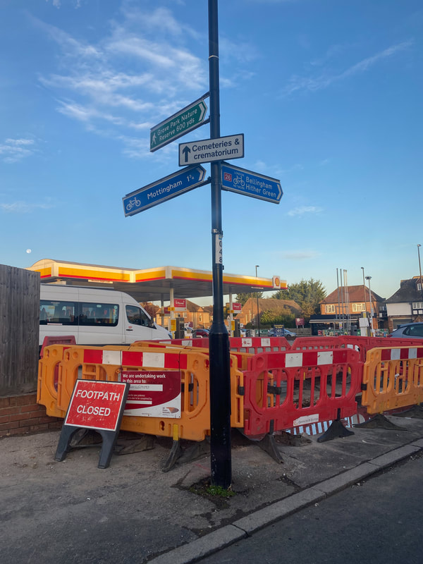
After viewing Stephen Shore's image, I decided to capture one of my own that I could analyse in a similar way. The though process behind this image was rapid, as I was in a car as I captured it which limited the time I could think and compose it. However, I am still quite pleased with the outcome. Initially, I was drawn to the orange and red of the sign and the gates restricting that area and the same colours on the roofing of the petrol station. The link was clear and I felt as if they correlated well. Furthermore, the complementary colours of the blue sky and the oranges add another level of complexity. I have always been drawn to complementary colours as the contrast allows each colour to be much more visible on their own and simply, they flow nicely together. One thing in the image that I noticed after analysing it was the moon in the sky in the middle on the left. This reinforces the motif of opposing factors in the image as it was taken during the day, yet the moon remains out. These small details take a while to notice and take time to think about, which is what I intend to make a viewer do in order to take the simpler things into consideration.
|
Photobook


Physical copy of my book


When creating this book, I thought deeply about which images to pair together as diptychs, which ones were better by themselves and also the order these images appear. With the diptychs, I placed images that clearly had a link in terms of composition or similar subject matters. The sequencing of the images took more thought as I had to continuously flip through the online copy of my book as I wanted it to feel relaxing to look through. I did not want the viewer's eyes to be strained and overwhelmed by too many images all at once, so I spaced out the diptychs and placed solo images and a way to 'relax' between each page. I feel as if that I was successful with this intention, in terms of structure, but with the actual images, I'm not sure if I am pleased with the outcome. Some of the diptychs feel too loosely linked, so I would replace some of the images to make them work better together.
David Campany & Polly Braden - Adventures in Lea Valley
|
'Adventures in Lea Valley' is a joint project between two individuals, who were married at the time, would go out on walks and photograph the Lea Valley before it was completely gentrified, but they would share one camera. Then, the images were used to create a photobook. However, with each image, we are unsure as to who captured the photograph. With each page, I feel myself questioning why the photograph was taken and what Campany and Braden wanted to document with the viewer. At the time these images were taken, the areas and people presented would have perceived them as normal and regular, however now, it is impossible to see this land like this again.
The idea of sharing a camera interested me as it relates to how I began my journey of photography. Additionally, it has inspired me to conclude my personal investigation in such a way with my mother, as it would feel as if I have completed my journey cyclically. |
    |
Developing further
In order to develop my personal investigation, I have conducted a gallery of my photographs and I have asked the viewers to answer three questions. I have decided to do this so I can get closer to answering my own question of 'What are the specific aspects that entice the viewer and what are the reasons as to why?'. Without others viewing my photographs, I would not be able to conclude other opinions other than mine and I feel as if this experiment will be helpful.
Below are the images I displayed in the exhibition:


My exhibition
With each of the images that I displayed, I printed them out on A4 paper and made them more presentable by mounting them on mountboard. Then, I ordered them on a shelf on the wall, roughly at eye level.

After viewing all of the images, I gave a slip with three questions for the viewers to answer. I chose to give it to them after looking at the images and away from the gallery of images as it would be able to test what image they genuinely remembered and liked and the real reasoning behind it as they would not be able to rethink and relook.

|
Process and viewings of the exhibition


It was interesting to see people having a genuine interest in my photographs and I liked that many were audibly laughing and questioning my choice of subject matter. The majority of these people were not photography students, which meant they had no prior knowledge on my project which led me to realise that my photographs could appeal to the general public. When asking them to answer the questions, I made them leave the room and make sure not to talk to others to influence their opinions and thoughts. However, some felt as if the questions were difficult to respond to, especially when I asked them to caption it (I wanted captions like in Dalton's 'Shit London'). Additionally, I stated that each individual could mention what they thought my project was about on the back, but not many did so.
Responses to the images


Some of the responses were exactly what I wanted and it answered my questions well, however many did not do what was instructed and mentioned more than one image, as well as ignoring the bottom request to caption it. The two images that were most popular were the one of the bin and the stars in the sink. I was pleased with this response as despite having worries that people would judge my photographs in a negative manner, my personal favourite (the bin) was remembered most amongst the public and they most reacted with a humorous response.
My discovery
Through this exhibition that I conducted, I have realised that my worries about presenting my photographs were really not needed. Photographs are all captured light, making it interesting regardless of its societal status. Despite a bin being one of the dirtiest and most overlooked things on the streets, it has gained the attention of the public, due to me photographing it and displaying it, consequently heightening its status. This made me realise that the unusual and ordinary nature of the subject matter is what makes it interesting, not simply the aesthetic value of the image as there are more stereotypically attractive images in this exhibition. Additionally, previous to this, I would never have thought that people would respond to a photograph of a sink as it is such an ordinary thing in the world. People had stated that they would not have thought to photograph the things I do, nor would they have noticed them. Hopefully, as a result of this exhibition, people will have gained this different perspective of these regular aspects in life and think of them as more than they are initially perceived.
Online exhibition process
My initial plans for my online exhibition consisted of creating an interactive webpage with a collage that included aspects that could be clicked and it would open up a larger album of related images of that specific thing that was pressed.
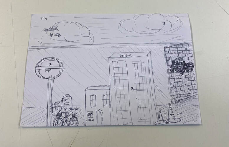
(Fig. 1) Initial sketch
In order to create this collage, I first sketched a general idea (Fig. 1) of how I wanted to compose the image and what subject matters I wanted to focus on and make sure to include. The asterisks are where I wanted the viewer to click. I separated the different images into folders which were titled with what they were or what they showed and I grouped similar images together. The titles of my folders were: buildings, cones, graffiti, poles, random objects, rubbish, signs, the sky and stickers. I planned to include 5-15+ images for each. After this, for every aspect that I wanted to include, I used the subject select tool in photoshop so I could remove the subject from its background and place it onto my new selected photograph. I decided that I wanted to make it easiest for the viewer to spot what to click on, although there are some that I wanted to disguise as part of the image.
My process on Photoshop


To make it completely obvious where to click, I made the parts of the background image that were not important black and white and kept th aspects that should be clicked in colour. Additionally, I decided to add slightly transparent red dots as points where the viewer should click in order to see the whole collection of photographs. Since it is difficult to perfectly align the dots on Weebly by simply using images and spacers, I decided to add the dots on the actual collage using photoshop and instead, put a completely transparent image roughly on top of these indicators on Weebly and link the links to the previously mentioned, different collections of photographs. I created these links as ones that are hidden in the navigation.


Though this version of my ideal online exhibition is not perfect and the clickable part of the image is not as accurate as I'd like it to be, I feel like it turned out quite well. The main issue is that the spacers and images do not appear in the same spot on every device, so it is recommended to view this exhibition on a Macbook Pro as it is the best alignment. If I had better technology and knowledge, I would ensure that the interactive points stayed where I wanted to, no matter the device. Also, I would like to have a larger quantity of things that I could click on and create a much larger body of work.
To access the interactive version, click here: :)
